01
From 0 to 1
Build Design System at Yirental
Overview
In January 2019, I did a volunteer job at a start-up company, called Yirental. It provides a platform for users to find rental housing. It’s a bit like Airbnb but focuses more on long-term rental. And most of its users are Chinese in North America. As the product designer on the team, my role is to solve design inconsistencies by building a Design System for current and future end-users and engineers.
Duration
Jan 2019 - Mar 2019
Team
1 Product manager
2 Developer
Tool
Figma
Role
Lead Product Designer
User research
Interaction & Visual Designer
Intro To Yirental
Yirental is a startup committed to building trust in the rental industry. It establishes an online rental marketplace through its app and website.
Users can find reliable housing, match ideal roommates and post rental requests in renter mode as well as list and manage properties in homeowner mode.
In the past three years, Yirental has helped over 200,000 users achieve their goals.Currently, it has more than 100,000 registered users.

02
Motivation
UNDERSTAND THE USERS
Yirental is a small company and lots of time people try to get things done as fast as possible and pay less attention to the guidelines. When I worked on the first few projects there, I found the current design system is a loosely maintained google doc, without much consistency. And when I looked at the existing products, I found different modules often use different design components, depending on who is the designer.
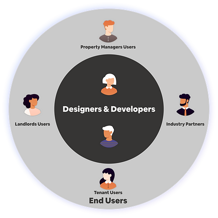
So this would cause issues for two groups of people. The first group is designers and developers at Yirental. With a poor design system, it’s hard for them to find out standard components and reuse them. And this can increase the cost of development.
The second group that got affected are our end users. They may see inconsistent interfaces and get confused.
I feel that this will become more of an issue, as Yirental grows and hires more designers and engineers. So I decide to start building a real design system at an early stage.
DESIGNER & DEVELOPER INSIGHT
Designers & developers feel struggled taking care of the design when creating new products.
END USERS INSIGHT
End-users feel confused with inconsistent design in Yirental’s product.

Problem
03
UI INVENTORY
The first thing I did is conduct UI inventory. Basically, I collected all the UI components into an inventory table, based on the existing products (click the image). On the right side is the example of an inventory table. It helps me summarize and compare all the design components and spot the problems in the design system.
Then the second thing I did is interview other designers and engineers on the design system. I showed the UI inventory table to them and collected their feedback. I also asked them what would be useful in helping them adopt a design system.


So based on the research I did, I found there are 2 categories of issues.
-
The first one is poor efficiency of use. As I mentioned at the beginning, our so-called design system, was just a google doc. The doc was not maintained. It’s hard for us to search and pick up a component right away.
-
The second category of issues is lacking consistency and rules.
The current design system is not standardized and has multiple styles for one component. As you can see in my UI inventory on the right, we have more than 10 styles of buttons, more than 6 cards shadow elevations, and 3 different fonts.
Moreover, there’s no hierarchy or organization of those components. I’ll talk about details in the design solution.
04
Design Direction
Design Principles & Style Guide
To solve those problems, the new design system should ideally have a few things.
First, it should have design principles, so designers know the rules of them when they change the design system or add new components.
Secondly, it should have a consistent style guide, which has detailed specifications and can be searched or used efficiently.
The style guide should also provide examples and templates, so designers can easily reuse them for creating new products.
Overall Design principles

User Centricity
Legibility
Accessibility
Efficiency

Consistency
Color and font
Patterns
Rules

Clarity
Metaphors
States & hierarchies
Standard Usage
Single signifier

Scalability
Adaptability to future
Direct manipulation
Templates
Style guide of design systems
1.
Styles - the usage of colors and typography are defined by 3 key considerations are accessibility, consistency, and legibility
Accessibility
-
Color blind
-
Refer to WCAG 2.0
Consistency
-
Orange is the primary action color for all Yirental products
-
Numbers displayed with the same width
Legibility
-
Open Sans is legible in both small and large sizes
-
Numbers displayed with the same width

Elements - standard usage, states & hierarchies, and single signifier
2.
As you might still remember, one problem with the existing google doc is that designers and developers have a hard time finding the component they are looking for.
To prevent the same problem in our new design system, I grouped all the components into 12 categories. Each of them has been designed to solve a specific UI problem base on the user tasks. Designers can quickly find the elements they need based on the category.
Standard Usage
-
Universal elements
-
Repetitive patterns
States & Hierarchies
-
Different states
-
primary and secondary hierarchies

Patterns - effortlessness, feedback, and efficiency
3.
I tried to create some commonly used patterns such as catalog, forms, and dialog, applying the styles and elements I previously designed.
And similarly, I create these patterns by considering the key factors -effortlessness, feedback, and efficiency.
For example, when designing the pattern of the form(click image), I have arranged them in a layout, that an actual product will use. So when designers adopt them later, they only need minor adjustments with little effort.
I also address the cases where users need feedback, for example, they enter invalid information and the red line will show up, telling them to correct the info.
Lastly, for the efficiency of use, designers can get variants of a pattern easily.
Effortlessness
-
Proximity principle
-
Strong hierarchy
Feedback
-
Errors and validation
Efficiency
-
Derive variants of design easily
Test & Adopt
05
Before applying the design system to all products, I first apply it to my design project. This one is called a long-term rental application.
We also went through the critic and user testing of the new design system.
After addressing the feedback, we got the green light to adopt this design system for all ongoing and future projects.
Another example using the design system. It’s an ongoing project called property management, which helps landlords manage and track their properties. For example, their recent cash flow and requests. This is something I’m currently working on.
To help the whole team to adopt the system, I did two things:
Increase Awareness
-
Present and promote the design system to designers and engineers
Create Procedure
-
Every design will be evaluated based on whether it adopts the new design system or not in design review meetings.
06
Reflection
My biggest learnings 👩🏻💻
-
Think big enough to solve the long-term problems.
-
Consider different scenarios and states for design patterns.


